
Visual perception is one of the most essential channels for human communication — and within that, color plays a uniquely powerful role.1 As the most impactful element of visual experience, color has proven to be a strategic asset across fields such as sports, marketing, education, and health communication.2
Specific Colors and What They Mean in Marketing and Health Communication
Color is a constant sensory presence — and it seems to influence psychological aspects in humans, as it has shown to have the power to trigger emotional, psychological, and even behavioral responses. One famous example: in 1979, a director at the American Institute of Biosocial Research observed unusual shifts in patient behavior seemingly tied to color exposure. To test his theory, he convinced a naval prison to paint its holding cells pink. The outcome? A dramatic drop in violent incidents. According to a U.S. Navy follow-up: “Since the beginning of this procedure… there have been no incidents of erratic or hostile behavior.”3
But color doesn’t just calm — it can activate, alert, inspire, or repel. It shapes how people feel, decide, and remember.3
Psychologists in marketing suggest that color influences up to 60% of a consumer’s immediate acceptance or rejection of a product, environment, or brand. First impressions of color are formed in under 90 seconds, making it a powerful tool for any communication strategy.3
Here’s what the research says about specific colors and their associations:3
- Blue is associated with wealth, trust, and security.
- Gray is linked to strength, exclusivity, sophistication, and success.
- Orange has affordability, accessibility connotations.
- Green is perceived as fresh, clear, and pleasant, but when illuminated in skin tones, it becomes repulsive or associated with fatigue and guilt.
- Red stimulates action, attraction, precision — but also alertness or avoidance, depending on context.
- Purple is primarily associated with joy, childhood, playfulness.
- White has a calming effect, producing lower levels of tension.
Color doesn’t just affect perception — it also impacts cognition. Studies show:3
- Red enhances memory for negative terms.
- Green enhances memory for positive words.
- A glimpse of green before a creativity task can boost performance.
Surprised by how much colors can shape perception and behavior? Let’s explore practical examples of how colors can impact real-world communication performance.
Can Colors Influence Behavior on Social Media?
We’ve seen that colors can trigger emotions and shape human behavior — but do they influence how people behave online?
That’s the question two U.S. researchers set out to answer using data from Pinterest. They analyzed the dominant colors in millions of tagged images and built a mathematical model to explore whether certain hues made images more shareable.3
Their findings revealed notable patterns:³
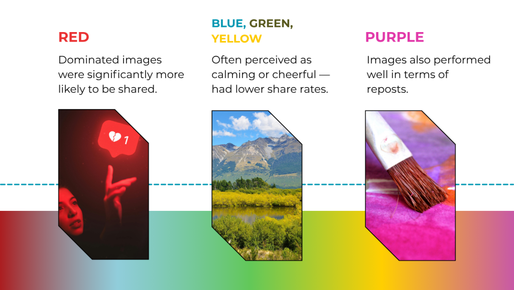
Interestingly, the research suggest that…3

One interpretation for this might be that users may be more inclined to share visuals that convey excitement (red) or elegance (purple) rather than those that feel cool or relaxed (blue/green/yellow).
This area still holds a wealth of possibilities and numerous open questions, but this study represents the first step toward understanding how colors can modify human behavior in the online environment.3
How to Choose Colors for Effective Knowledge Sharing?
Color plays a critical role in knowledge dissemination — especially when the goal is to make complex scientific information more accessible. Visuals aren’t just decorative; they help clarify data, support storytelling, and improve how quickly audiences absorb and retain information. A well-designed figure with a thoughtful color palette can significantly improve comprehension and engagement.4
One simple yet effective strategy is to use variations of a single color — for example, combining navy blue and sky blue to create contrast while maintaining harmony. Alternatively, you can take a more dynamic approach by selecting a group of related colors across the spectrum, a technique often used in graphic design to create a more vibrant and engaging presentation.4
Below, we explore practical considerations when choosing color palettes for figures, infographics, or any material aimed at communicating scientific information clearly and memorably.4
Incorporating Color Theory into Palette Design
Color theory provides practical guidelines on how to best combine colors within a palette. Understanding its fundamentals can help create more visually appealing figures.4
Since most audiences encounter images via computer, tablet, or smartphone screens, the RGB model (Red, Green, Blue) is recommended for designing figures. This model mimics modern digital displays.4
Using a color wheel can aid in understanding relationships between colors and guide palette selection (Figure 1).4
Color theory offers valuable guidance when designing visual content — helping teams create combinations that are not only attractive but also intuitive to interpret.4 For professionals working with promotional and digital materials, mastering the basics of color theory can significantly elevate the visual impact of presentations, infographics, and educational content.
RGB: The Standard for Digital Media
Because most audiences interact with content on screens (computers, tablets, smartphones), the RGB color model — based on Red, Green, and Blue — is ideal for designing digital figures.⁴ This model mirrors how modern devices display color, making it essential for creating consistent and vibrant visuals.
Using the Color Wheel
A color wheel is a simple but powerful tool for understanding color relationships and selecting well-balanced palettes (see Figure 1).⁴
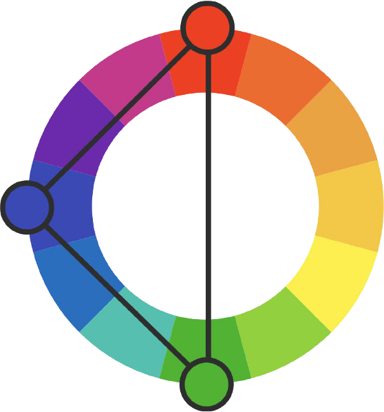
Figure 1. 12-color RGB color wheel with its primary colors marked. Adapted from Plante and Cushman. Res Pract Thromb Haemost. 2020;4:176–180.4
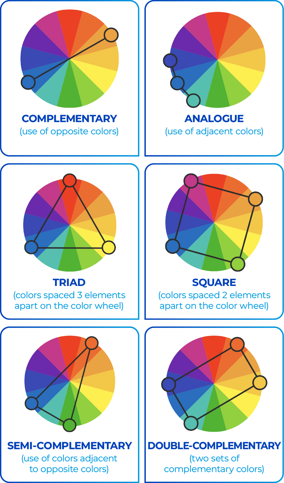
While some color choices are based on intuition or brand identity, the color wheel can guide more intentional design by showing how colors relate to one another. Common palette combinations are shown in Figure 2.4
Choosing the Right Palette Based on Your Data5
Beyond aesthetics, palette selection should be guided by the type of data being communicated. Here are three primary palette types, each with a distinct function:
1.Sequential Palettes
Used for ordered data, such as values increasing from low to high. These palettes use a gradient of a single hue, transitioning from light to dark. Darker shades typically highlight the most significant values (Figure 3).
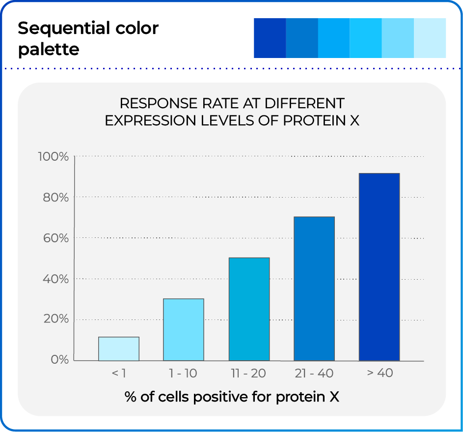
Adapted from Hattab et al. PLoS Comput Biol. 2020 Oct 15;16(10):e1008259. 5
2.Diverging Palettes
Ideal when the data has a meaningful midpoint (e.g., zero, average). These palettes emphasize both ends of the spectrum with contrasting hues, while lighter tones represent central values.
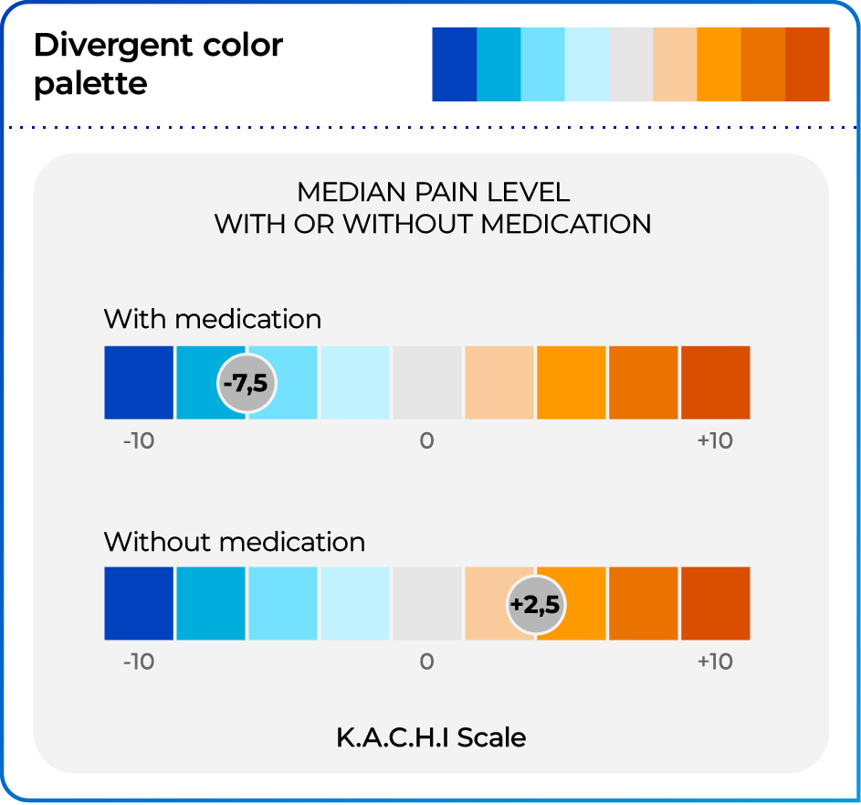
Adapted from Hattab et al. PLoS Comput Biol. 2020 Oct 15;16(10):e1008259. 5
3. Qualitative Palettes
These are used for categorical data, where color represents distinct classes without implying order or magnitude. Typically, varied hues with similar brightness are employed to distinguish between groups, ensuring that differences in color do not suggest differences in value. This type of palette is particularly effective for visualizing nominal and categorical data (Figure 5).
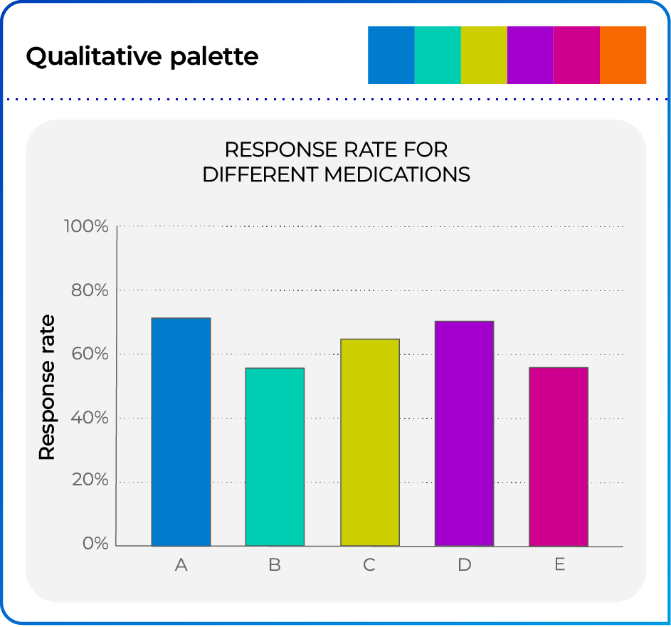
Adapted from Hattab et al. PLoS Comput Biol. 2020 Oct 15;16(10):e1008259. 5
Designing for Accessibility: Reaching Colorblind Audiences4
Approximately 1 in 12 men and 1 in 200 women have some form of color vision deficiency. For these individuals, standard color-based visuals can be hard — or even impossible — to interpret.
When communicating scientific data, especially in digital or print formats, designing with accessibility in mind is not just inclusive — it strengthens clarity, usability, and credibility.
Key strategies for accessible figure design:
- Don’t rely on color alone. Use patterns, outlines, or line styles (e.g., solid vs. dashed) to differentiate between experimental groups.
- Use high-contrast color pairs. Avoid combinations with similar brightness levels. For instance:
- Red and blue at the same brightness = hard to distinguish
- A single color used in light and dark shades = easier to read
- Grayscale can also be effective when applied as part of a high-contrast visual strategy (see Figure 6)
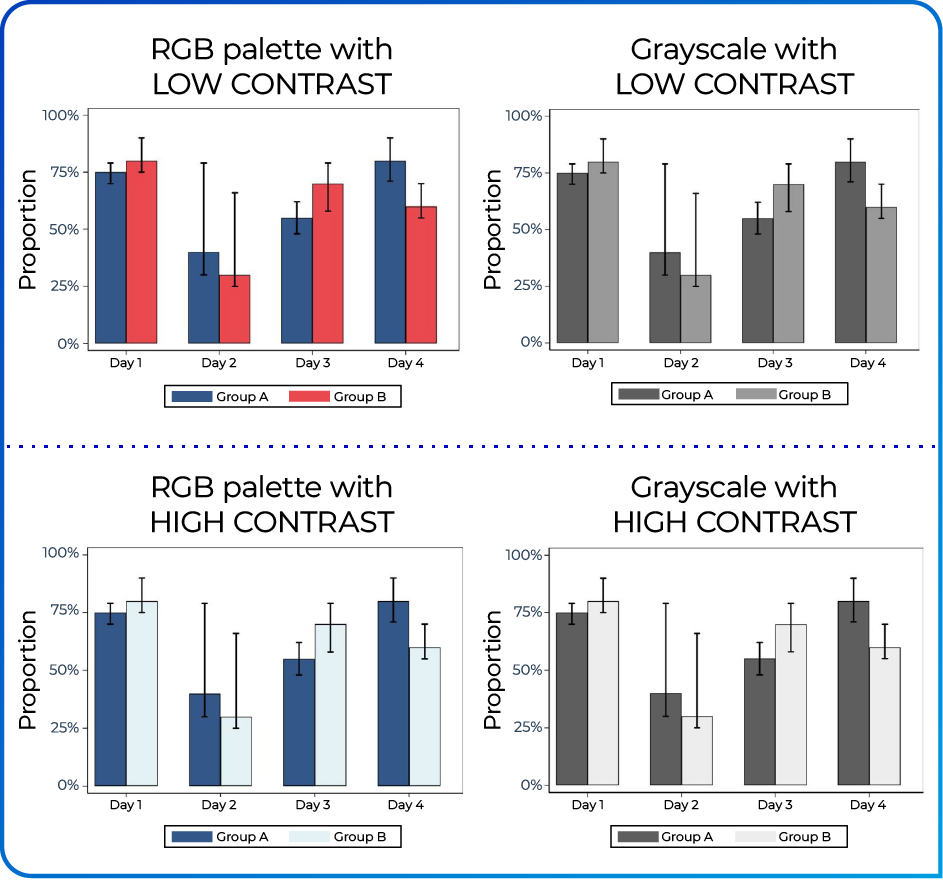
Adapted from Plante e Cushman. Res Pract Thromb Haemost. 2020;4:176–180. 4
Conclusion
Color influences more than just aesthetic appeal — it shapes emotions, enhances memory, and can even increase the shareability of digital content.³ In scientific communication, a well-chosen, high-contrast color palette improves both readability and comprehension — while also ensuring accessibility for audiences with color vision deficiencies.4
Whether your goal is to strengthen brand engagement or to communicate clinical data more effectively, thoughtful color choices can amplify impact and clarity.3,4
Before designing your next chart, infographic, or campaign asset, keep these key considerations in mind:

REFERÊNCIAS
- Crameri F, Shephard GE, Heron PJ. The misuse of colour in science communication. Nat Commun 2020;11(1):5444.
- Dzulkifli MA, Mustafar MF. The influence of colour on memory performance: a review. Malays J Med Sci 2013;20(2):3–9.
- Bakhshi S, Gilbert E. Red, purple and pink: the colors of diffusion on pinterest. PLoS One 2015;10(2):e0117148.
- Plante TB, Cushman M. Choosing color palettes for scientific figures. Res Pract Thromb Haemost 2020;4(2):176–80.
- Hattab G, Rhyne T-M, Heider D. Ten simple rules to colorize biological data visualization. PLoS Comput Biol 2020;16(10):e1008259.