At the forefront of innovation, the healthcare industry—particularly the pharmaceutical sector—constantly faces the challenge of communicating complex information in a clear and effective way. In this context, infographics have emerged as a powerful tool, transforming complex data into easy-to-understand visuals that enhance comprehension and retention of critical information.1
For medical and marketing professionals alike, infographics are not merely a visual enhancement—they are a strategic asset for educating, informing, and engaging audiences.1
This article explores how visual tools like infographics are reshaping communication in healthcare and the pharmaceutical industry, highlighting their applicability, effectiveness, and impact across various areas—from scientific dissemination to pharmaceutical product marketing.
INFOGRAPHICS AT THE FOREFRONT OF MEDICAL COMMUNICATION
By embracing visual strategies such as infographics—a blend of “information” and “graphics”—the healthcare and pharmaceutical industries are adopting a communication format that prioritizes clarity and quick information uptake.1
These visual representations, which combine imagery, data visualizations, and concise text, have proven effective not only in promotional materials but also in scientific content, making it easier to disseminate knowledge in a format that is rapidly absorbed by diverse audiences. While this approach has been widely used in other industries for years, its adoption in medical and pharmaceutical communication is relatively recent, reflecting a shift in how complex data is presented and understood.1
Particularly on mobile devices—where brevity and clarity are even more critical—infographics offer an ideal solution, despite some initial resistance to moving away from traditional formats toward more streamlined visuals.1
In the figure below, we see an example of how pain levels can be communicated using both a traditional bar chart and a visual representation, which is increasingly adopted in health communications.1
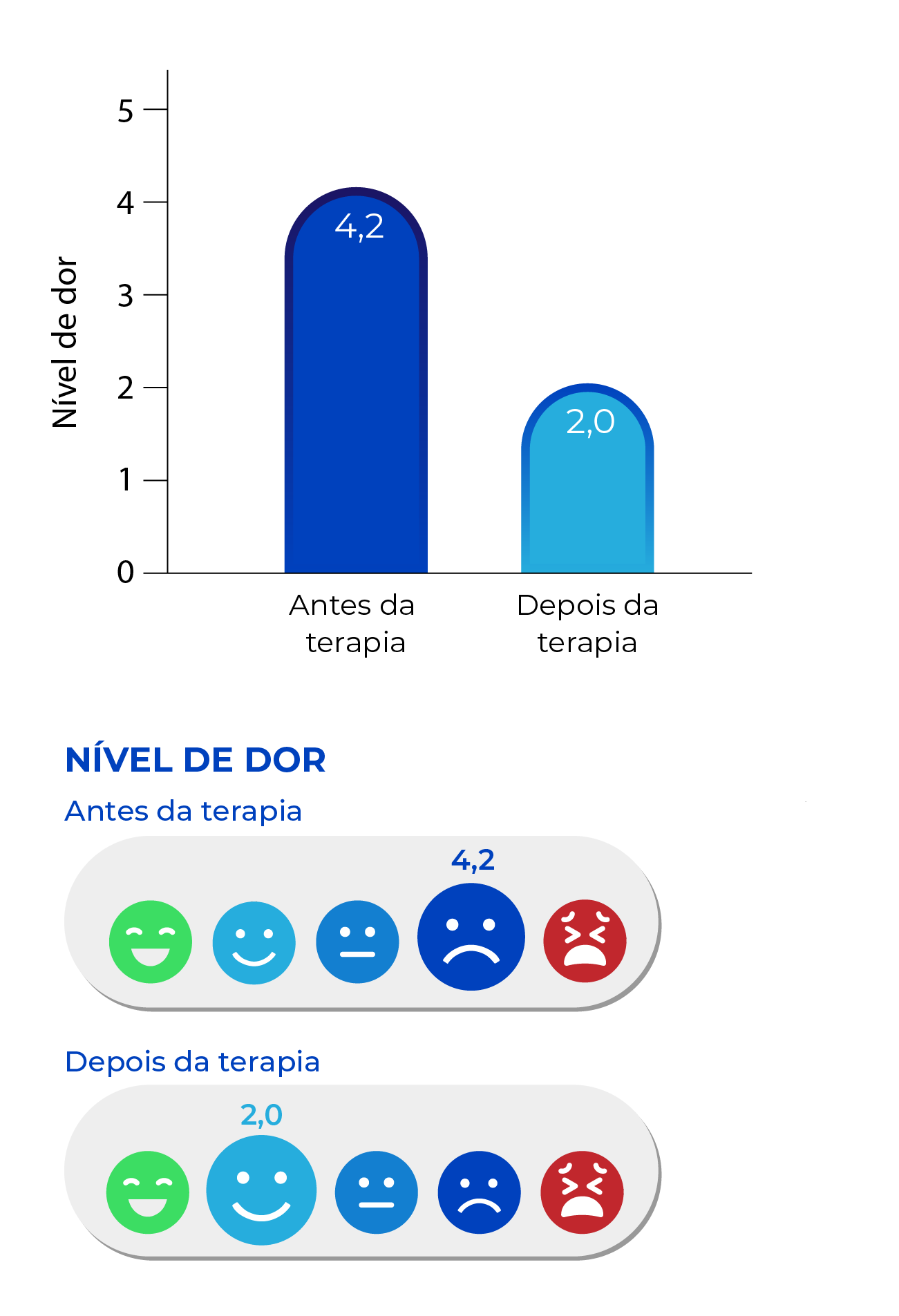
Adapted from Power EGM. Pharmaceut Med 2023; 37(2):97–101.
THEORY BEHIND THE POWER OF VISUAL MEDIA
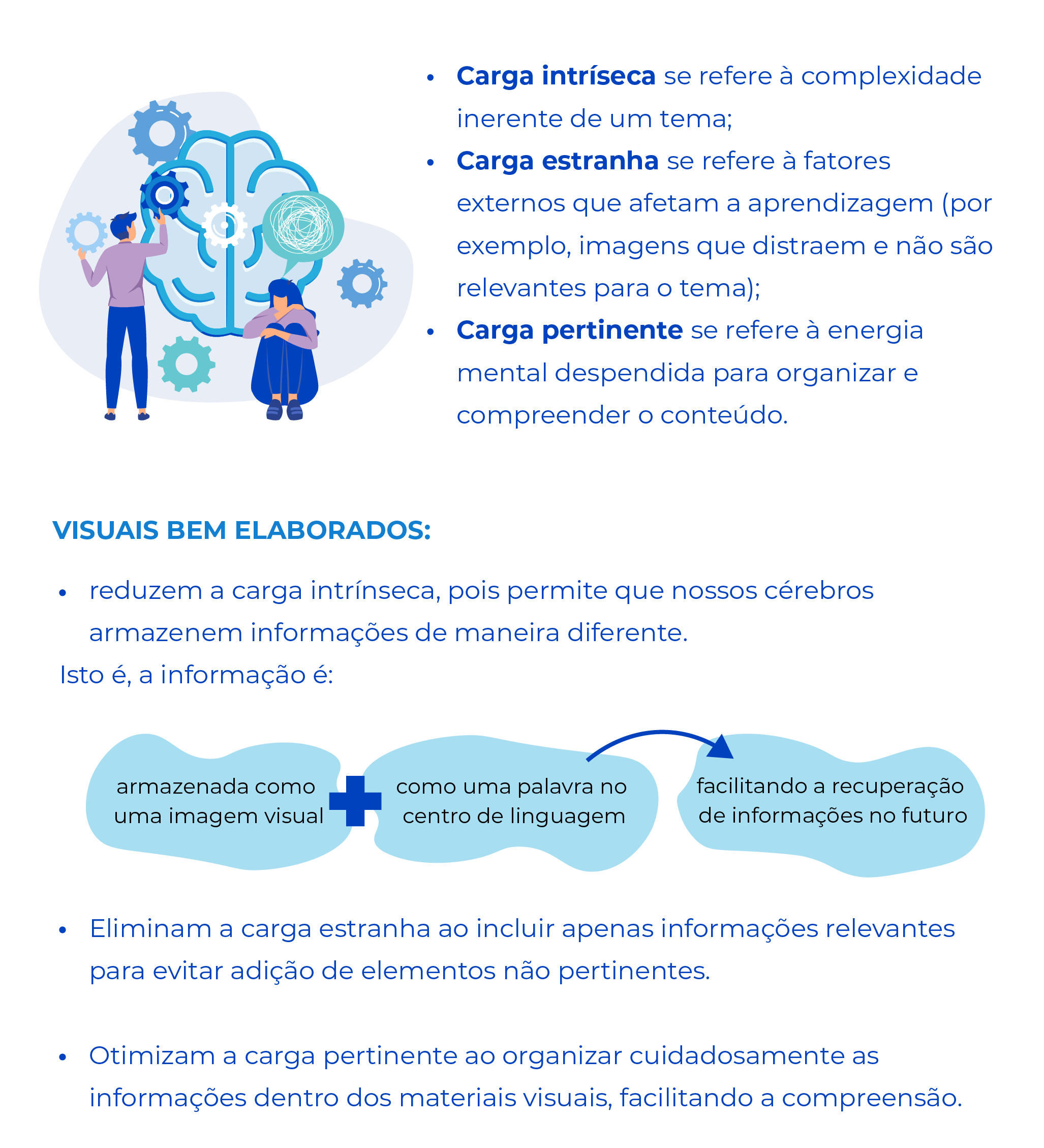
It is widely recognized that visual elements play a crucial role in helping audiences understand complex information. This effectiveness is supported by cognitive theories that demonstrate how visual resources reduce the cognitive effort required to process and interpret data. Such reduction is essential in pharmaceutical and medical communications, where clarity and accuracy of information are imperative.2
Cognitive Load Theory, a theory behind the power of visual media, describes three components that contribute to this mental effort:2
HOW ARE MEDICAL RESEARCH INFOGRAPHICS BEING USED?
The use and perception of infographics in medical and health contexts were evaluated through a comprehensive online study. The survey included 254 participants representing a wide range of profiles—including healthcare professionals, researchers, academics, and members of the general public. A significant majority (89%) reported using smartphones to access visual content, and 67% accessed it via Twitter/X. Notably, 92% of respondents viewed infographics as valuable tools for communicating medical and health research findings.3
An interesting insight from the study is that, although 76% of participants said they were likely to consult the full article after viewing an infographic, 41% admitted to using infographics as a substitute for reading the full article at least half the time.3
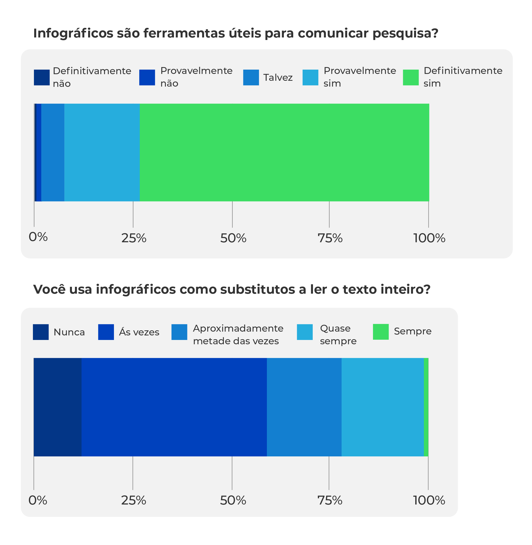
In the bottom image, 41% admitted to using infographics as substitutes for full-text articles at least half the time (including the responses “always,” “almost always,” and “about half the time”). Adapted from Zadro JR et al. BMC Med Educ 2022; 22(1):677.
Given the growing trend of using infographics as an alternative to full-text reading, it becomes increasingly important that these visual summaries are meticulously crafted. They should provide not only an appealing overview, but also include essential elements such as:3
- the studied population,
- sample size,
- interventions performed,
- relevant results and statistics,
- comparisons with previous data,
- a clear conclusion or “takeaway message”.
By including these components, infographics don’t just grab attention—they also deliver an informative and faithful summary of the research presented.
THE IMPACT OF INFOGRAPHICS ON SOCIAL MEDIA
Infographics have emerged as powerful tools across social media and other digital platforms, making it easier to understand complex concepts through visual representations. They have been widely used to educate a broad range of audiences—including healthcare professionals, patients, and individuals interested in health topics—promoting not only engagement, but also education and knowledge dissemination.2
These visual tools offer concise summaries on a wide variety of topics, supporting the communication of critical information such as disease presentations, diagnostic algorithms, and data on new treatments. Their effectiveness in simplifying and conveying complex content often results in greater sharing and interaction on social media.2
Quantitative studies using metrics like the Altmetric Attention Score (AAS) show that infographics generate significantly higher engagement compared to traditional text-based formats². For example, the journal Arthroscopy found that their visual summaries receive more attention on social platforms than full-text research articles, as demonstrated by the increased number of Twitter/X mentions—even in the absence of significant differences in citation rates (Figure 3).4
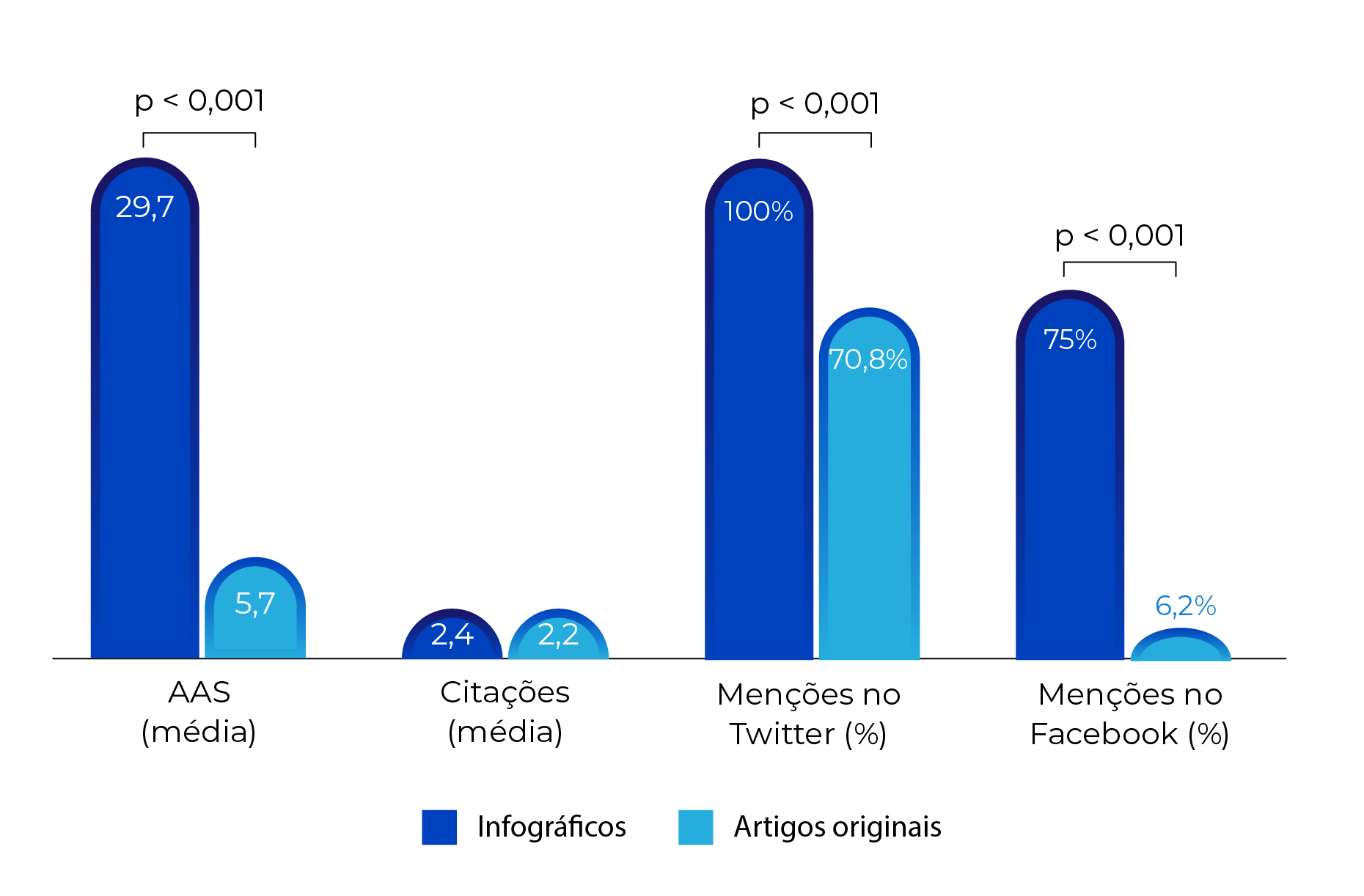
This phenomenon reinforces the idea that infographics, by visually representing research data, not only broaden the content’s reach but also enhance the impact of the disseminated studies, contributing significantly to scientific and medical communication in the digital environment.2,4
CONCLUSIONS
Infographics offer numerous advantages for effectively, succinctly, and interactively communicating complex medical information — including on digital platforms such as smartphones — making it easier to understand scientific data.1
Their effectiveness is attributed to their ability to:2
- Reduce cognitive load, making it easier for the brain to process and retain information.
- Focus on essential elements, removing irrelevant or unnecessary details.
- Organize data in a way that maximizes understanding of the content.
Moreover, within social media—currently one of the most relevant platforms for information dissemination—infographics show remarkable potential to boost engagement, as evidenced by increased views and interactions.4
However, to be effective in summarizing medical and health research, infographics must be clear, transparent, and sufficiently detailed.³ In this regard, pharmaceutical marketing teams and the medical community can learn a great deal from science communication experts like the team at KACHI, who specialize in conveying complex information in concise and versatile formats.1
Ultimately, for infographics to fulfill their role in effectively translating medical and health research, they must be developed with clarity, transparency, and careful attention to detail—ensuring that key data is fully and accurately communicated.³ This visual format holds great promise for marketing professionals and healthcare audiences alike, drawing inspiration from established communication strategies used in media and publishing sectors.1
How to cite this article:
KACHI. Infographics in medical communication: driving clarity and engagement [Internet]. São Paulo: KACHI Pharma Marketing and Scientific Communication; Published on 2025 May 29. Available from: https://www.kachi.com.br/en/infographics-in-medical-communication-driving-clarity-and-engagement/
References:
- Power EGM. Considerations for Effective Communication of Medical Information. Pharmaceut Med 2023;37(2):97–101.
- Spicer JO, Coleman CG. Creating Effective Infographics and Visual Abstracts to Disseminate Research and Facilitate Medical Education on Social Media. Clin Infect Dis 2022;74(Suppl_3):e14–22.
- Zadro JR, Ferreira GE, O’Keeffe M, Stahl-Timmins W, Elkins MR, Maher CG. How do people use and view infographics that summarise health and medical research? A cross-sectional survey. BMC Med Educ 2022;22(1):677.
- Kunze KN, Vadhera A, Purbey R, Singh H, Kazarian GS, Chahla J. Infographics Are More Effective at Increasing Social Media Attention in Comparison With Original Research Articles: An Altmetrics-Based Analysis. Arthroscopy 2021;37(8):2591–7.